How can you improve home page slider usability for your donors? (See my last post on how these sliders are hurting your fundraising.)
In fact, this is not just for your donors. But for all key users of your website.
That’s one of the justifications for using sliders. The need to cater for different audiences. So you end up cramming more content for different users into your home page slider.
Instead, this is my advice for dealing with home page sliders.
Tip 1. Turn your slider content into static links or boxes for each of your major audiences. Like this home page from Seeing Eye Dogs.
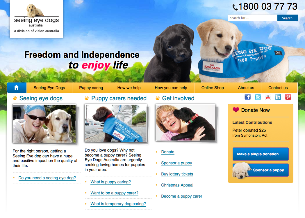
The three boxes are for three key audiences. People who need seeing eye dogs, puppy carers and donors. Note that none of the audiences are the CEO, the Board or the web development department.
This home page has been designed for users not content approvers. Or disapprovers as the case may be.
Now isn’t that much easier for visitors than using a slider?
But if you must use home page sliders…
Now I know the reality is many of you will have trouble eliminating the home page slider due to office politics.
However, sliders are not all created equal. Some types are definitely more horrible than others.
With this in mind, I’ve listed five extra tips to make the home page slider more usable for donors.
Tip 2. Avoid the dot-style slider. Like this one from Peter Mac. See the seven little dots in the lower right hand corner of the photo?
Your donors and other users could mistake them for a decorative part of your image (as I did). They may not realise those pretty little dots are a key part of your slider navigation. And they’re a pain to click.

Tip 3. Reduce the number of slides. The Peter Mac example above has seven. That’s a lot of content buried in your slider.
If each slide loads for five seconds, that’s 35 seconds worth of waiting if you miss the slide you want. Of course you can click back. But which dot? How many slides ago was it?
Aim for three or four slides at most.
Tip 4. Avoid the arrow-style slider. In the example below from WaterAid, you don’t actually see the arrows unless you hover over the image. This is also bad because you don’t know how many sliders are in the sequence. Three? Four? Seven?

Tip 5. Give the donor the chance to stop the slider. So they can look at your content properly if they want to. See the little stop button in this example on Care Australia’s home page.

Tip 6. Use a label-style slider. This is where you have boxes below or to the side of the slider describing the content.
The label version is far superior to the teeny dot-style, arrow-style and numbered boxes. Your users can at least get a preview of the content on each slide. They can also see easily how many slides you have.
Below are three examples. World Vision has nice clickable boxes underneath its slider.

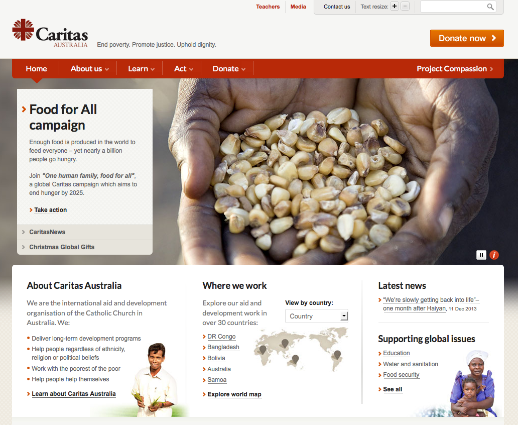
Caritas uses a dynamic text box on the left of its slider. When you click a specific item in the box, it expands to show more text and changes the image at the same time.
The Bible Society uses static text boxes to the right of its slider.

Happy home page sliding! Although I’d suggest it’s better to stop using your sliders altogether.