A few years back, I overheard a web development officer at an Australian charity. He was proudly saying they were revamping their website home page – and it would have a cool new slider.
Well, they do indeed have a cool-looking slider now. One of those huge rotating banners with teeny tiny dots to click if you want to change images.
I didn’t think much about it at the time. Although I did notice sliders seemed to be all the rage amongst non-profits.
But now I have to wonder at what cost. Especially when I received the results of this AB split test from car maker Suzuki. (This was as shown on Which Test Won although you need to be a premium member to see the content).
The image below shows the two test versions. Version A with four static images and Version B with the slider.
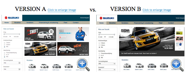
Version A increased total clicks on the images by 28%. And in fact, a third version (below) with only two static images had 54% more clicks than the slider version.

Ouch.
Yes, this example comes from the commercial world. But because I know squillions of charities and non-profits use these carousels on their website home pages, I decided to investigate further.
It turns out a lot of other web experts agree that home page sliders are bad. Issues highlighted include:
Changing too fast – The experts all said this. So I timed a few from various non-profit sites. They all seem to be set around five seconds.
Now you can probably read a slider headline in five seconds. But you actually need more time to decide whether you want to click further. Especially if you look at other elements on the home page then decide to click further. So you click – but it registers a microsecond after it transitioned to the next slide. Or by then the slider is on the third or fourth slide.
Is that what you really want a donor to experience if they’re trying to donate to a specific appeal?
Banner blindness – users ignore the slider because they feel it’s too much like advertising.
Do you want your donor to pass over your major annual fundraising campaign as an annoying ad?
Lower clicks and conversions – because sliders are too frustrating to use.
Do you really want to lose those donations?
Conflicting messages – everybody in your charity wants a piece of the home page real estate. But the slider just dilutes everyone’s message.
Do your donors want to sift through up to a half dozen messages before they get to the right slide to click?
Content is pushed below the fold – the user has to scroll to get to easily accessible information.
Do you want to dazzle your donors with technical brilliance or actually guide them with useful and usable information above the fold?
Web page loading speed – sliders make your home page slower to load.
How about making the website donor experience as quick and easy as possible?
Rendering badly on mobile devices – it’s hard enough trying to click on one of those dots on a full size screen. On a mobile phone with a big fumbly thumb? Forget it.
How easy are you making it for your donors to stick with you on their iPhones and Samsungs?
Now you’re welcome to tell me you’ve AB split-tested your home page and found your slider does better for you than static images. In that case, I’ll get back in my hole and say no more.
Otherwise, I strongly suggest you revisit your use of a home page slider. Here are 6 tips on how to fix your home page slider.